BONEYARD BREWERY

Project introduction
Boneyard Brewing Company began as an idea with no existing identity. The brewery needed a complete brand from the ground up—from its name and logo to a packaging system that could support multiple beers while remaining instantly recognizable.
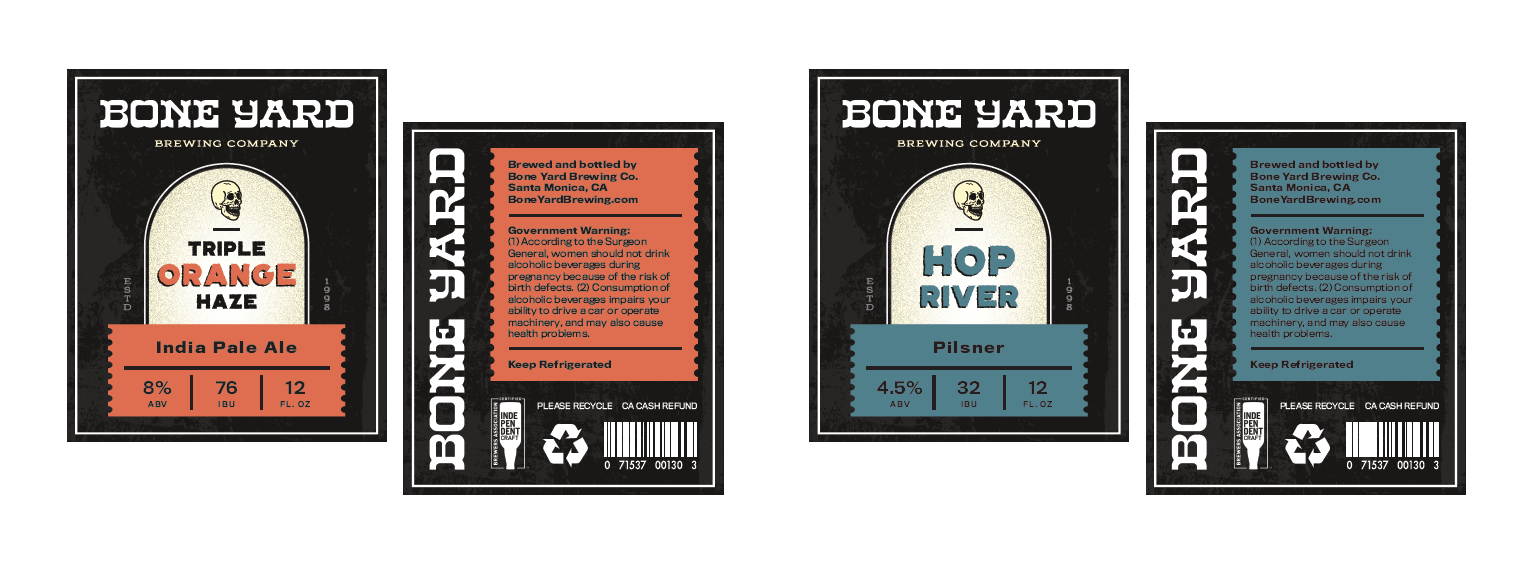
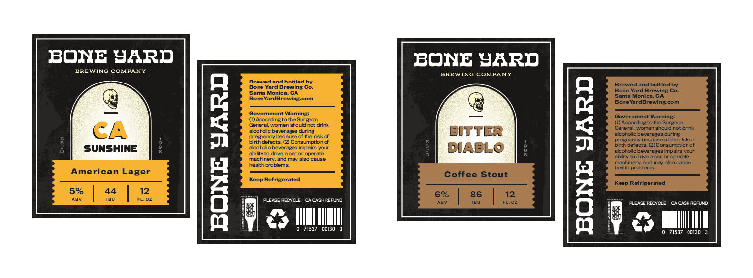
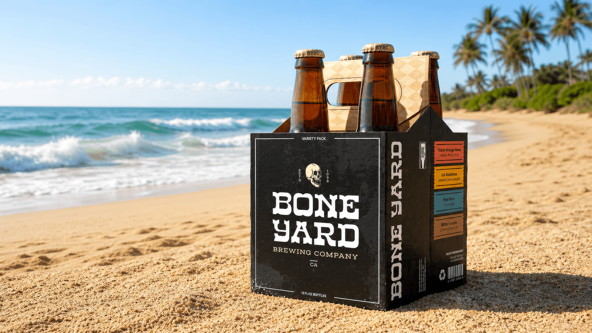
The goal was to create a rugged, unmistakable brand that felt authentic in the craft beer space. The final deliverables included the brewery's name, logo, visual identity, bottle labels for four flagship beers, and a custom four-pack carrier that tied the entire product line together.
Brand Identity Development
Every brewery starts somewhere.
For Boneyard Brewing Company, there wasn't an existing logo, color palette, packaging system, or visual direction to build from. Aside from a vision for the brewery and four beer recipes, everything else had to be created from scratch.
The challenge wasn't simply designing attractive labels—it was building an identity people could recognize. The brand needed enough personality to stand apart on crowded shelves while remaining flexible enough to expand as new beers were introduced. Every decision, from typography and color to hierarchy and layout, had to contribute to a cohesive system rather than a collection of individual labels.
Because the packaging was designed as a real-world product, it also had to account for production requirements, legal labeling information, readability, and cost-effective printing methods.
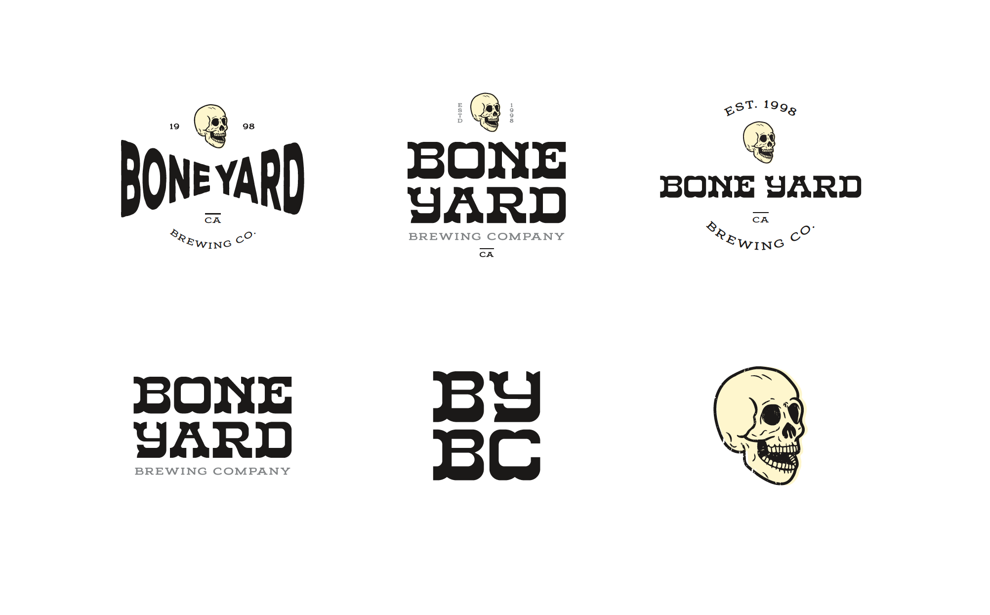
From-scratch Label + Package Design
Every successful brand begins with research before design.
The project started by exploring the craft beer landscape to better understand where Boneyard could fit while still carving out its own identity. Inspiration came from rugged Americana, vintage signage, tattoo culture, skate graphics, and the raw character often found in independent breweries.
After developing the brewery's name and visual identity, the packaging system began to take shape. Rather than designing four unrelated labels, each beer was created as part of a larger family. Color became the primary differentiator between varieties, while consistent typography, layout, and supporting graphics ensured every bottle immediately felt like part of the Boneyard lineup.
Throughout the process, every detail was carefully refined—from visual hierarchy and spacing to print specifications and mandatory regulatory information. The result is packaging that feels distinctive while remaining practical enough for real-world production.
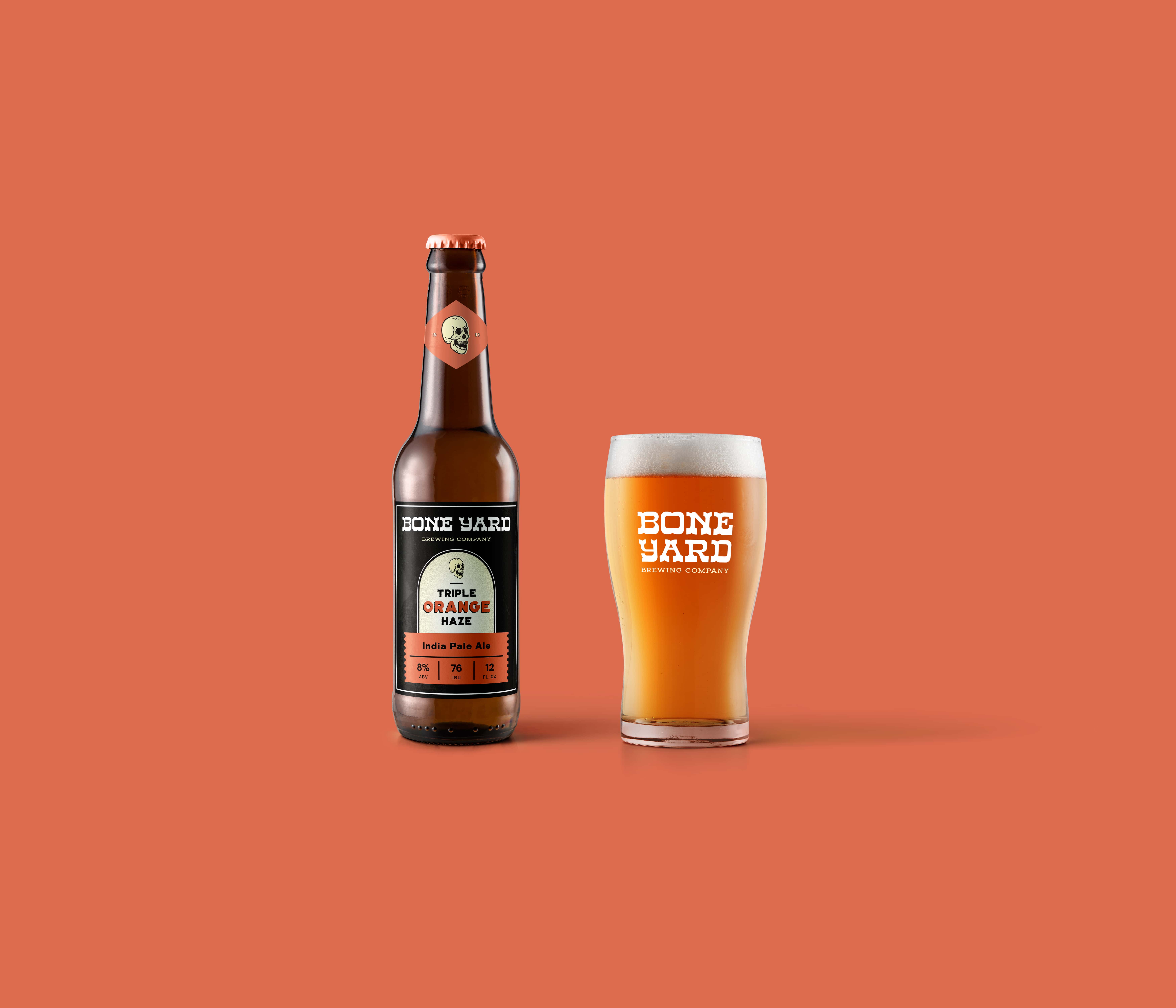
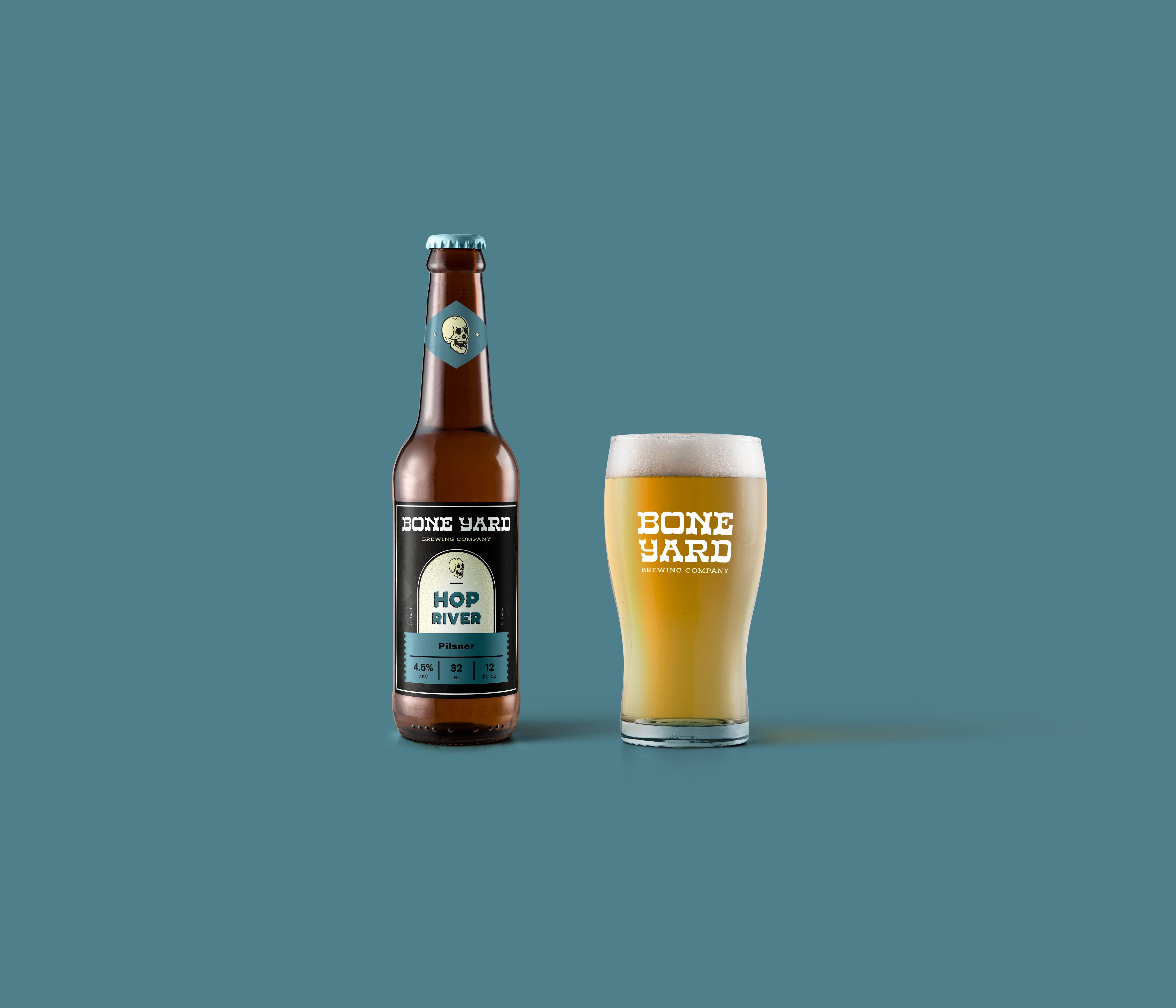
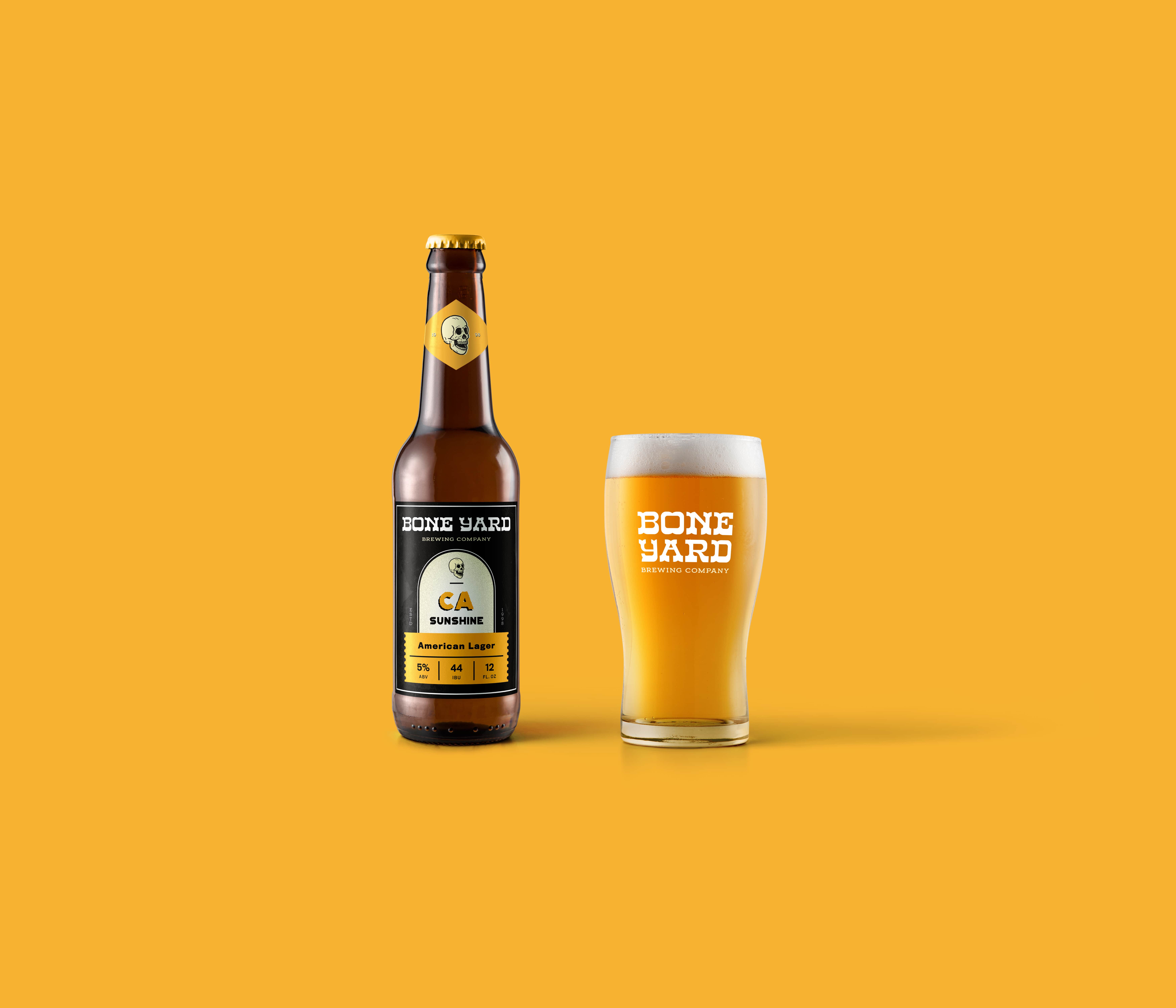
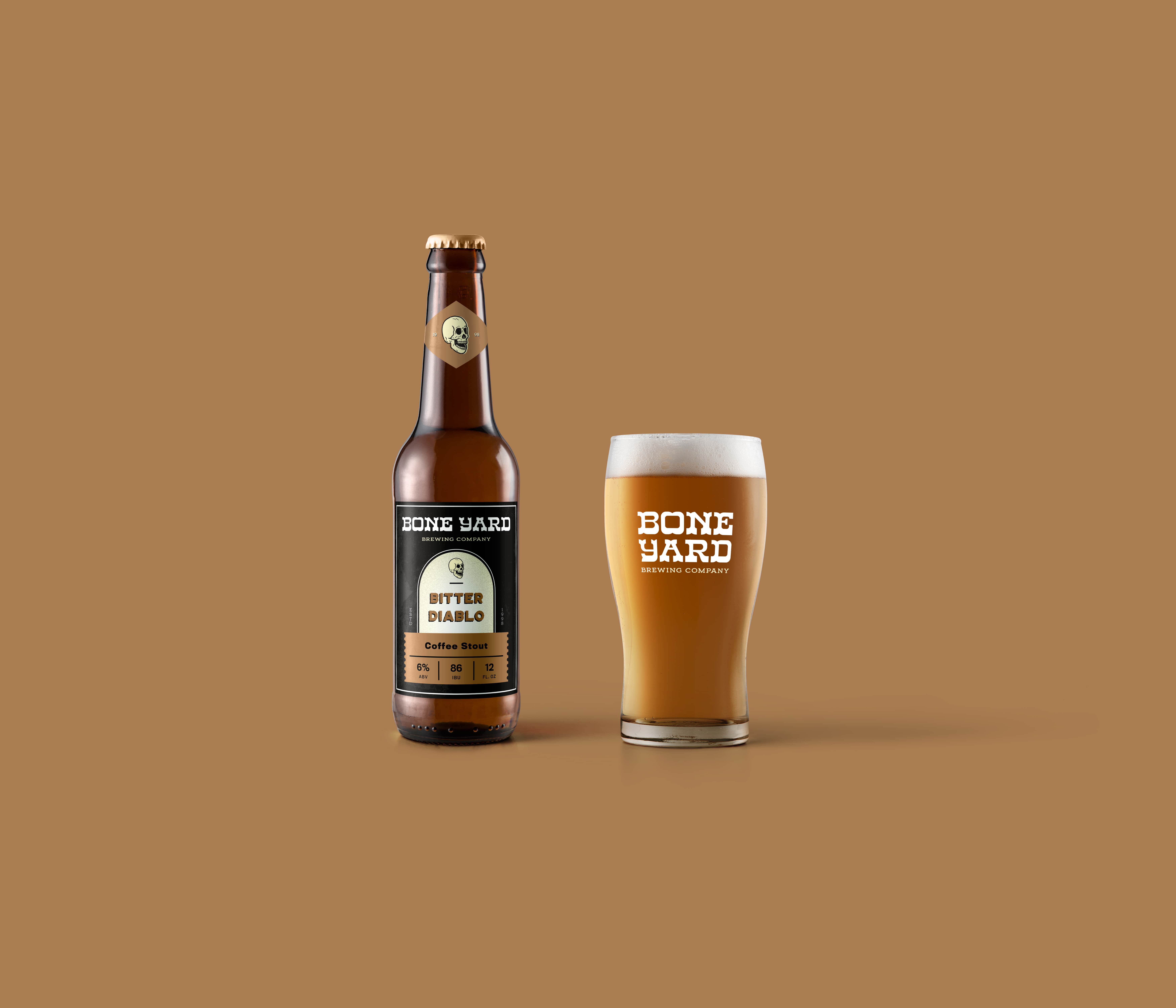
bold personality + a system built for growth.
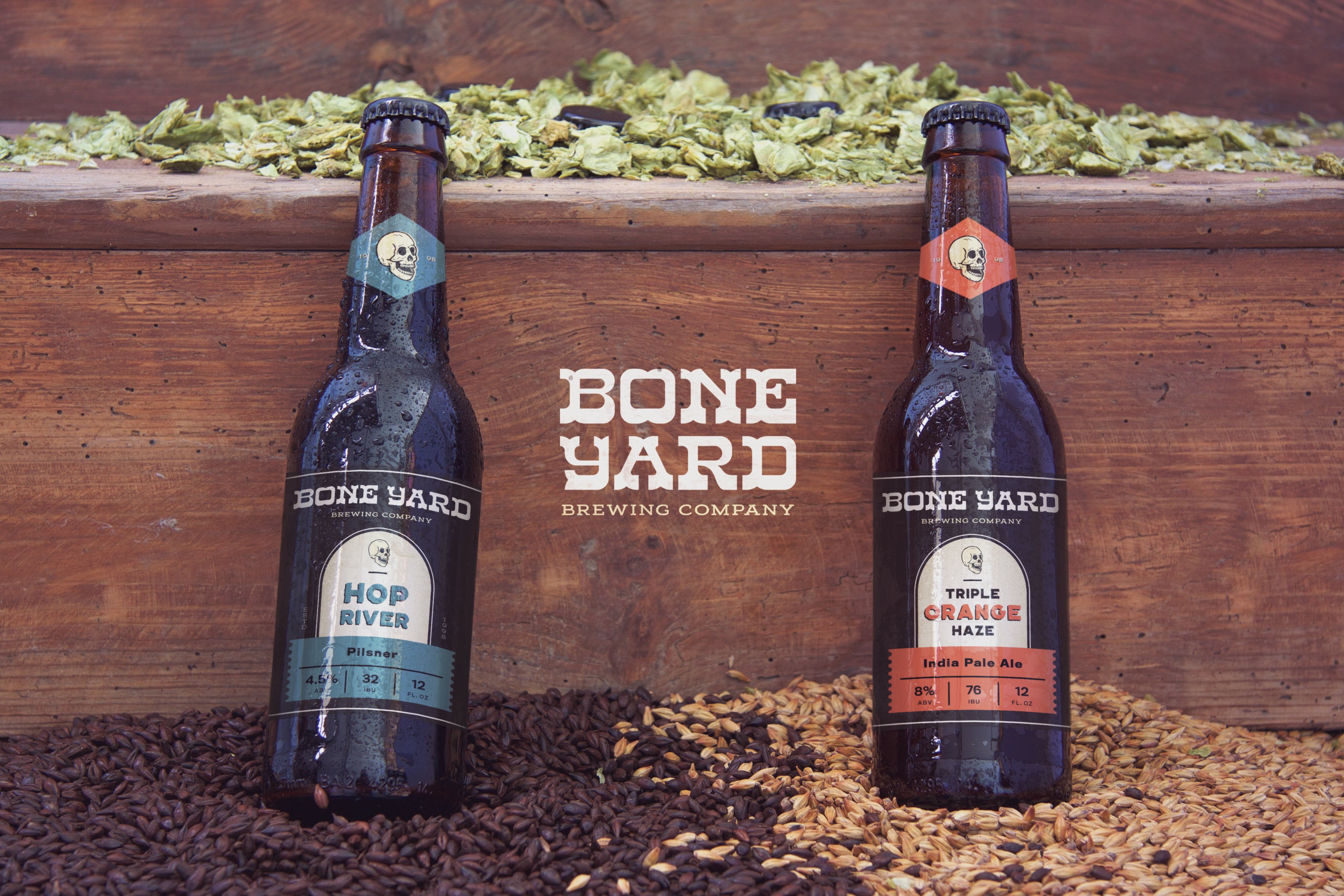
Each label carries its own unique color and beer name, allowing every variety to establish its own identity without sacrificing overall brand recognition. Together with the custom four-pack carrier, the collection creates a strong presence whether viewed as individual bottles or as a complete product lineup.
The visual language is intentionally rugged, drawing inspiration from vintage printmaking and hand-crafted design. Worn textures, bold typography, and restrained color palettes give the brand an authentic personality that feels confident rather than overdesigned.
Each beer is instantly recognizable as part of the same family, while maintaining enough individuality to stand confidently on its own.
Just as importantly, the brand occupies a space that feels uncommon within today's craft beer market. Rather than following colorful illustrations or heavily decorative artwork, Boneyard embraces a rugged, stripped-back aesthetic inspired by vintage Americana and independent culture. The result is a brand that stands out through confidence and simplicity rather than excess.
Most importantly, the system was designed with the future in mind. New beers can be introduced without reinventing the brand, allowing recognition and brand equity to grow with every release. All they need is a new name for the new beer, and a new color for the label, and it will fit right into the family of beers.